
Combobox vs. Multiselect vs. Listbox: How To Choose The Right One
 Articles on Smashing Magazine — For Web Designers And Developers
·
Feb 03, 2026
·
article
Articles on Smashing Magazine — For Web Designers And Developers
·
Feb 03, 2026
·
article
So what’s the difference between combobox, multiselect, listbox, and dropdown? While all these UI components might appear similar, they serve different purposes. The choice often comes down to the **number of available options** and their visibility.
Let’s see how they differ, **what purpose they serve** , and how to choose the right one — avoiding misunderstandings and wrong expectations along the way.
Not All List Patterns Are The Same
All the UI components highlighted above have exactly one thing in common: they support users’ interactions with lists. However, they do so slightly differently.
Let’s take a look at each, one by one:
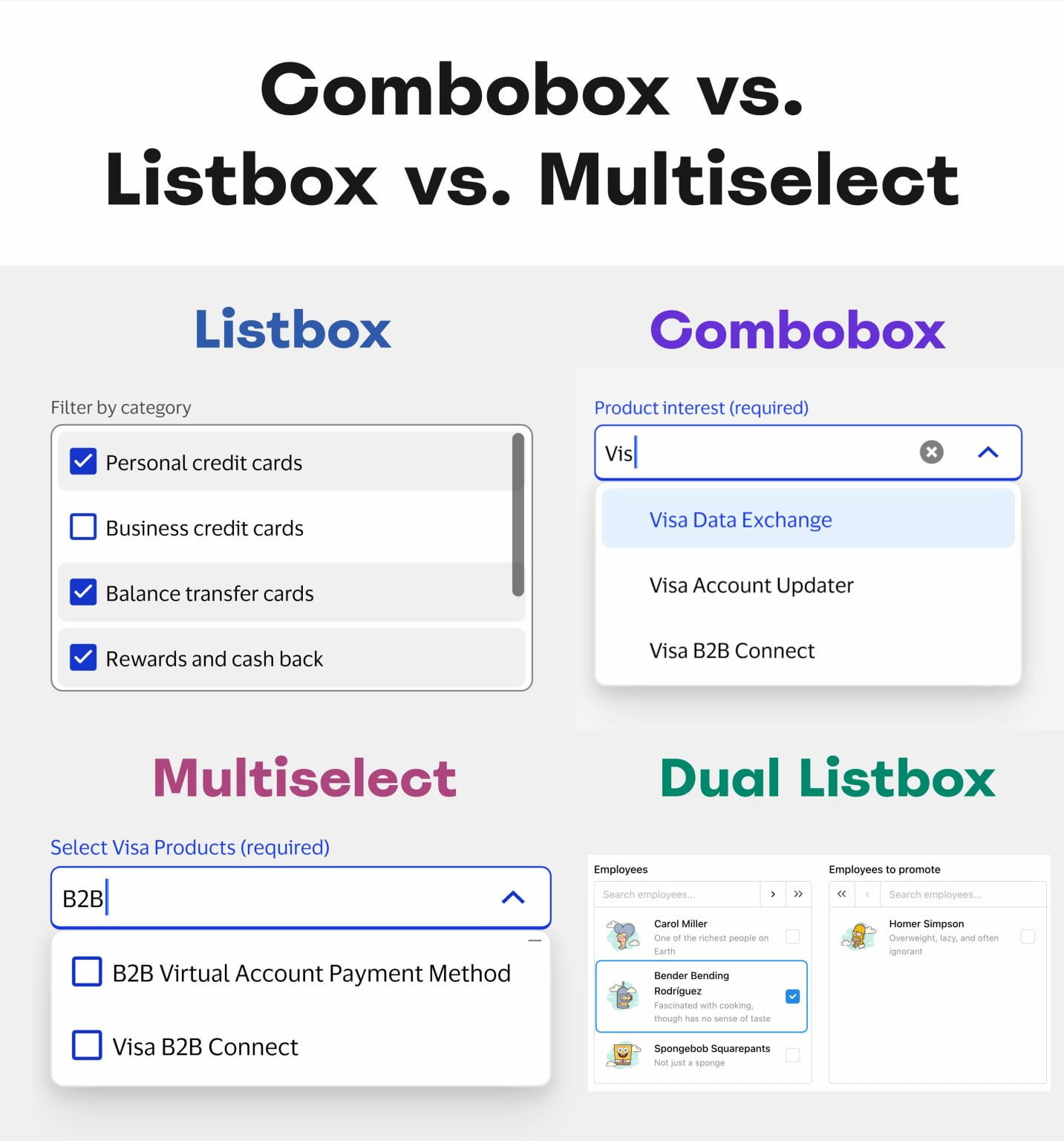
- **Dropdown** → list is hidden until it’s triggered.
- **Combobox** → type to filter + select 1 option.
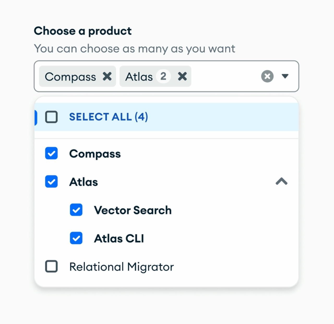
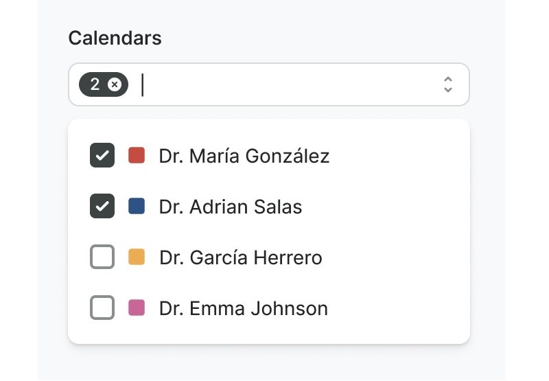
- **Multiselect** → type to filter + select many options.
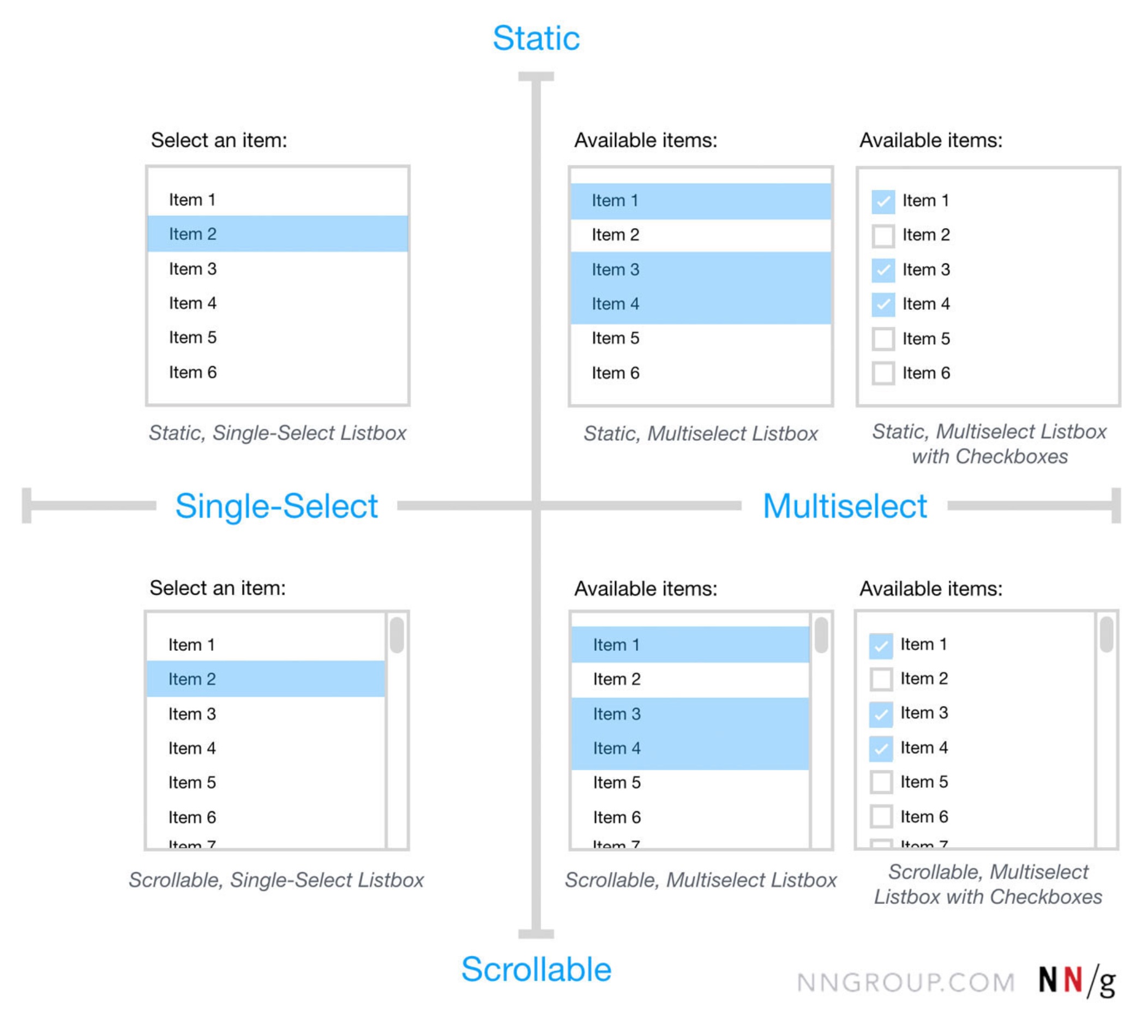
- **Listbox** → all list options visible by default (+ scroll).
- **Dual listbox** → move items between 2 listboxes.
In other words, _Combobox_ combines a text input field with a dropdown list, so users can **type to filter** and select a single option. With _Multiselect_, users can select many options (often displayed as pills or chips).
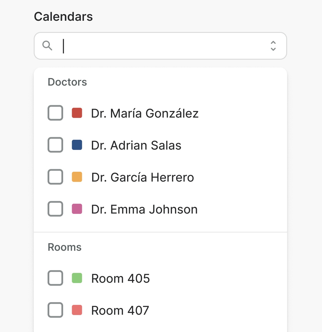
_Listboxes_ display **all list options visible** by default, often with scrolling. It’s helpful when users need to see all available choices immediately. _Dual listbox_ (also called _transfer list_) is a variation of a listbox that allows users to **move items between two listboxes** (left ↔ right), typically for bulk selection.
Never Hide Frequently Used Options
As mentioned above, the choice of the right UI component depends on **2 factors** : how many list options are available, and if all these options need to be visible by default. All lists could have tree structures, nesting, and group selection, too.
There is one principle that I’ve been following for years for any UI component: **never hide frequently used options**. If users rely on a particular selection frequently, there is very little value in hiding it from them.
We could either make it **pre-selected** , or (if there are only 2–3 frequently used options) show them as [**chips or buttons**](https://smart-interface-design-patterns.com/articles/badges-chips-tags-pills/), and then show the rest of the list on interaction. In general, it’s a good idea to always display popular options — even if it might clutter the UI.
How To Choose Which?
Not every list needs a complex selection method. For lists with **fewer than 5 items** , simple radio buttons or checkboxes usually work best. But if users need to select from a **large list** of options (e.g., 200+ items), combobox + multiselect are helpful because of the faster filtering (e.g., country selection).
**Listboxes** are helpful when people need to access **many options at once** , especially if they need to choose many options from that list as well. They could be helpful for frequently used filters.
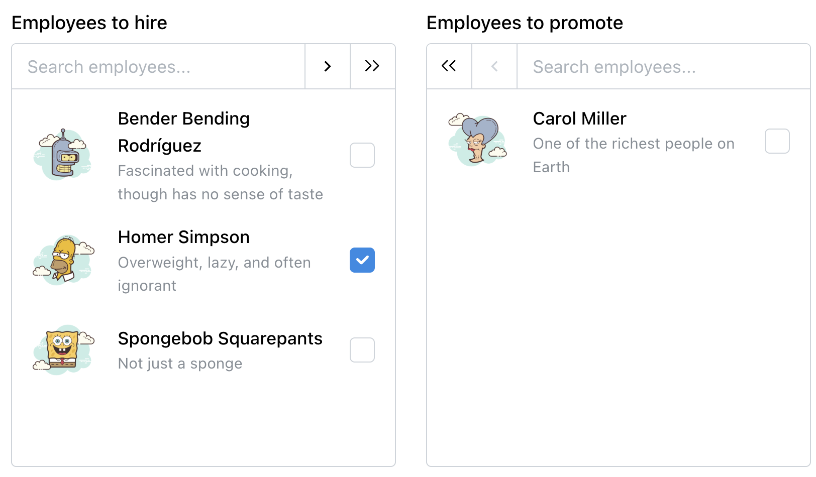
**Dual listbox** is often overlooked and ignored. But it can be very helpful for complex tasks, e..g bulk selection, or assigning roles, tasks, responsibilities. It’s the only UI component that allows users to review their full selection list side-by-side with the source list before committing (also called _“Transfer list”_).
In fact, dual listbox is often faster, more accurate, and more accessible than [drag-and-drop](https://smart-interface-design-patterns.com/articles/drag-and-drop-ux/).
Usability Considerations
One important note to keep in mind is that all list types need to support **keyboard navigation** (e.g., ↑/↓ arrow keys) for accessibility. Some people will almost always rely uponthe keyboard to select options once they start typing.
Beyond that:
- For lists with **7+ options** , consider adding “Select All” and “Clear All” functionalities to streamline user interaction.
- For lengthy lists with a combobox, **expose all options** to users on click/tap, as otherwise they might never be seen,
- Most important, **don’t display non-interactive elements as buttons** to avoid confusion — and don't display interactive elements as static labels.
Wrapping Up: Not Everything Is A Dropdown
Names matter. A **vertical list of options** is typically described as a “dropdown” — but often it’s a bit too generic to be meaningful. _“Dropdown”_ hints that the list is hidden by default. _“Multiselect”_ implies multi-selection (checkbox) within a list. _“Combobox”_ implies text input. And “Listbox” is simply a list of selectable items, visible at all times.
The goal isn’t to be consistent with the definitions above for the sake of it. But rather to **align intentions** — speak the same language when deciding on, designing, building, and then using these UI components.
It **should work for everyone** — designers, engineers, and end users — as long as static labels don’t look like interactive buttons, and radio buttons don’t act like checkboxes.
Meet “Design Patterns For AI Interfaces”
Meet [**Design Patterns For AI Interfaces**](https://ai-design-patterns.com/), Vitaly’s new **video course** with practical examples from real-life products — with a [live UX training](https://smashingconf.com/online-workshops/workshops/ai-interfaces-vitaly-friedman/) happening soon. [Jump to a free preview](https://www.youtube.com/watch?v=jhZ3el3n-u0).
[ ](https://ai-design-patterns.com/)Meet [Design Patterns For AI Interfaces](https://ai-design-patterns.com/), Vitaly’s video course on interface design & UX.
- [Video + UX Training](#)
- [Video only](#)
### Video + UX Training
$ 450.00 $ 799.00 [ Get Video + UX Training
](https://smart-interface-design-patterns.thinkific.com/enroll/3476562?price_id=4401578)
30 video lessons (10h) + [Live UX Training](https://smashingconf.com/online-workshops/workshops/ai-interfaces-vitaly-friedman/).
100 days money-back-guarantee.
### Video only
$ 275.00$ 395.00
[Get the video course
](https://smart-interface-design-patterns.thinkific.com/enroll/3476562?price_id=4397456)
30 video lessons (10h). Updated yearly.
Also available as a [UX Bundle with 3 video courses.](https://smart-interface-design-patterns.thinkific.com/enroll/3570306?price_id=4503439)
Useful Resources
- [Autocomplete: UX Guidelines](https://smart-interface-design-patterns.com/articles/autocomplete-ux/), by Vitaly Friedman
- [Combobox](https://playbook.ebay.com/design-system/components/combobox), by eBay 👍
- [Combobox](https://eui.elastic.co/docs/components/forms/selection/combo-box/), by Elastic
- [Combobox](https://designsystem.elisa.fi/9b207b2c3/p/082dd3-combobox), by Elisa
- [Combobox](https://www.mongodb.design/component/combobox/live-example), by MongoDB 👍
- [Combobox](https://design.visa.com/components/combobox/), by Visa 👍
- [Combobox](https://watson.docplanner.design/latest/watson-web/components/combobox/usage-guidelines-L68K6G51), by Watson (Docplanner)
- [Combobox](https://doc.wikimedia.org/codex/latest/components/demos/combobox.html), by Wikimedia
- [Combobox](https://garden.zendesk.com/components/combobox), by Zendesk
- [Multiselect (MongoDB Combobox Design Docs)](https://www.mongodb.design/component/combobox/design-docs), by MongoDB 👍
- [Multiselect Lookup](https://doc.wikimedia.org/codex/latest/components/demos/multiselect-lookup.html), by Wikimedia
- [Multi-select Combo Box](https://vaadin.com/docs/latest/components/multi-select-combo-box), by Vaadin
- [Multiselect](https://design.visa.com/components/multiselect/), by Visa
- [Transfer (Listbox example)](https://ant.design/components/transfer), by Ant Design
- [Listbox](https://hopper.workleap.design/components/Listbox), by Hopper
- [List Box](https://vaadin.com/docs/latest/components/list-box), by Vaadin
- [Listbox](https://design.visa.com/components/listbox/), by Visa
- [Dual List Selector](https://www.patternfly.org/components/dual-list-selector), by Red Hat (PatternFly)
- [Dual Listbox](https://www.lightningdesignsystem.com/2e1ef8501/p/763763-dual-listbox), by Salesforce (Lightning Design System)
- [Transfer List](https://v5.mantine.dev/core/transfer-list/), by Mantine
- [Dual Listbox](https://dashlite.net/demo1/components/misc/dual-listbox.html), by Dashlite
- [Badges vs. Pills vs. Chips vs. Tags](https://smart-interface-design-patterns.com/articles/badges-chips-tags-pills/), by Vitaly Friedman
- [Listboxes vs. Dropdown Lists](https://www.nngroup.com/articles/listbox-dropdown/), by Anna Kaley (NN/g)
https://smashingmagazine.com/2026/02/combobox-vs-multiselect-vs-listbox/