
ServiceNow Report Selection Guide | ServiceNow Reports tips and tricks
ServiceNow Report Selection Guide | ServiceNow Reports tips and tricks
Hi All,
Hope you are doing fine.
Reports are one of the important admin activities which give us a clear vision of data analytics. ServiceNow OOB supports around 30 + report types which leads to the following question:
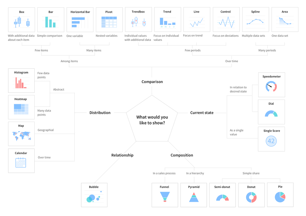
Which Report type is best suited for my use case?
In today's article, we will try to answer this question, and try to generate the guidelines which will help us to take a decision in which scenario /use case which report type is best suited.
So let's get started with the basic understanding of reports first,
What is a Report in ServiceNow?
A Report (often referred to as a chart or graph) is a graphical representation of data. Its goal is to convey information in a clear and succinct format.
Reports are as much an art as it is a science. Selecting the right type of chart and adding features that will enhance the visualization while keeping it readable can be quite challenging.
Whenever we have to create a Report you should ask these questions first.
- What you wanna say or show?
- How much data do you have?
- Is it real-time or over a period of time?
Based on the above questions we have I have categorized the reports into below categories :
- to Compare
- to show the Distribution
- to explain Parts of the Whole
- to tell the Trend over time
- to find out the Deviations
- to understand the Relationship
- Bar reports
- In a bar chart, values are indicated by the length of bars, each of which corresponds with a measured group. Bar charts can be oriented vertically or horizontally; vertical bar charts are sometimes called column charts. Horizontal bar charts are a good option when you have a lot of bars to plot, or the labels on them require additional space to be legible.
- Examples of Bar reports :
- Bar report
- Horizontal Bar report
- Pareto report
- Histogram report
- Bar report
- Pie and Donut reports
- You might be surprised to see pie reports being sequestered here in the ‘specialist’ section, considering how commonly they are utilized. However, pie charts use an uncommon encoding, depicting values as areas sliced from a circular form. Since a pie chart typically lacks value markings around its perimeter, it is usually difficult to get a good idea of exact slice sizes. However, the pie chart and its cousin the donut plot excel at telling the reader that the part-to-whole comparison should be the main takeaway from the visualization.
- Examples of Pie and Donut reports :
- Pie Chart
- Donut reports
- Semi Donut report
- Pie Chart
- Time series reports
- This type of chart is normally used for explaining trends over periods. The vertical axis always displays a numeric amount, while the X-axis indicates some other related factors
- Example of Time Series reports :
- Column report
- Line report
- Step line report
- Area and spline report
- Column report
- Multidimensional reports
- Charts are used for finding and/or showing the correlation (when one variable has an effect on another) between two or three variables.
- Example of Multi dimension reports :
- Multi-level pivot table
- Heatmap report
- Bubble report
- Multi-level pivot table
- Scores
- When you only have one number to show, just displaying the value is a sensible approach to depicting the data. When exact values are of interest in an analysis, you can include them in an accompanying table or through annotations on a graphical visualization.
- Examples of Scores report :
- Speedometer report
- Dial report
- Single score report
- Speedometer report
- Statistical analysis reports
- Statistical analysis is the collection and interpretation of data in order to uncover patterns and trends. It is a component of data analytics. Statistical analysis can be used in situations like gathering research interpretations, statistical modeling, or designing surveys and studies. It can also be useful for business intelligence organizations that have to work with large data volumes.
- Example of Statistical reports :
- Control report
- Trend Report
- Box report
- Trendbox report
- Control report

Hope you like this article, IF yes then please mark helpful.
Regards,
Amit Gujarathi

https://www.servicenow.com/community/developer-articles/servicenow-report-selection-guide-servicenow-reports-tips-and/ta-p/2346840