
Magnificent SVGs With And CSS Custom Properties — Smashing Magazine
 Articles on Smashing Magazine — For Web Designers And Developers
·
Nov 07, 0000
·
article
Articles on Smashing Magazine — For Web Designers And Developers
·
Nov 07, 0000
·
article
I explained recently how I use ``, ``, and CSS Media Queries to develop what I call [adaptive SVGs](https://www.smashingmagazine.com/2025/10/smashing-animations-part-5-building-adaptive-svgs/). Symbols let us define an element once and then _use_ it again and again, making SVG animations easier to maintain, more efficient, and lightweight.
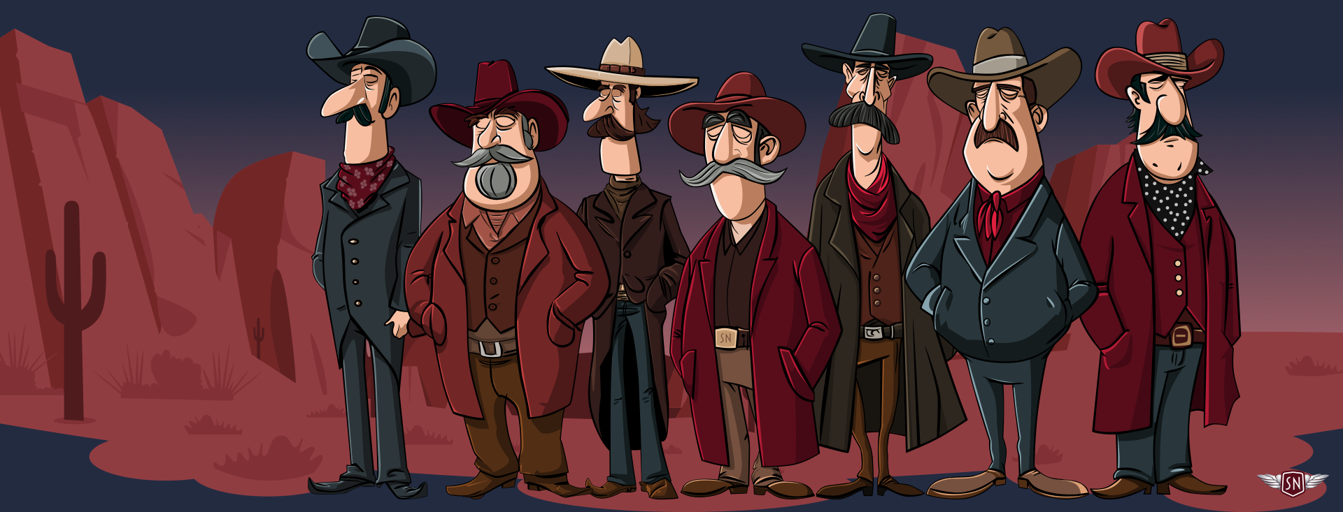
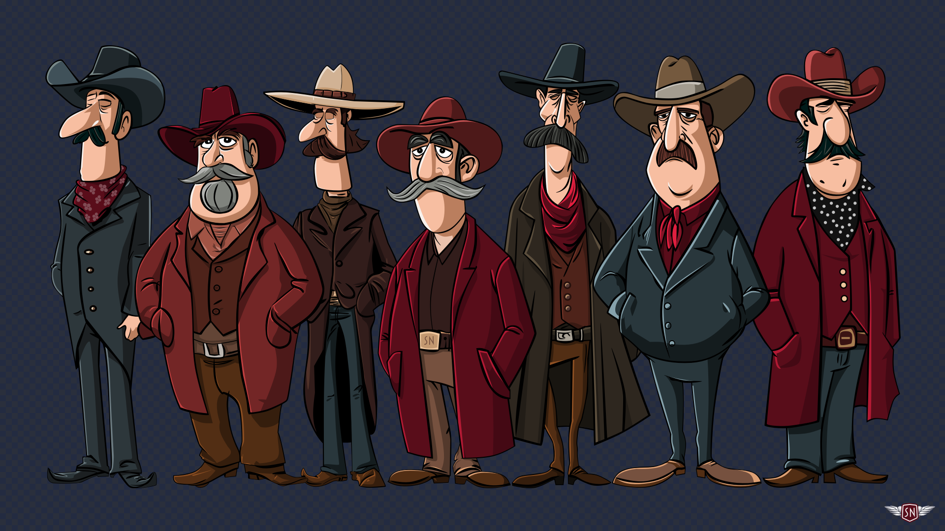
Since I wrote that explanation, I’ve designed and implemented new [Magnificent 7](https://stuffandnonsense.co.uk/blog/say-hello-to-my-magnificent-7) animated graphics across [my website](https://stuffandnonsense.co.uk/). They play on the web design pioneer theme, featuring seven magnificent Old West characters.
`` and `` let me define a character design and reuse it across multiple SVGs and pages. First, I created my characters and put each into a `` inside a hidden library SVG:
```
```
Then, I referenced those symbols in two other SVGs, one for large and the other for small screens:
```
```
Elegant. But then came the infuriating. I could reuse the characters, but couldn’t animate or style them. I added CSS rules targeting elements within the symbols referenced by a ``, but nothing happened. Colours stayed the same, and things that should move stayed static. It felt like I’d run into an invisible barrier, and I had.
Understanding The Shadow DOM Barrier
When you reference the contents of a `symbol` with `use`, a browser creates a copy of it in the [Shadow DOM](https://developer.mozilla.org/en-US/docs/Web/API/Web%5Fcomponents/Using%5Fshadow%5FDOM). Each `` instance becomes its own encapsulated copy of the referenced ``, meaning that CSS from outside can’t break through the barrier to style any elements directly. For example, in normal circumstances, this `tapping` value triggers a CSS animation:
```
```
```
.tapping {
animation: tapping 1s ease-in-out infinite;
}
```
But when the same animation is applied to a `` instance of that same foot, nothing happens:
```
```
```
.tapping {
animation: tapping 1s ease-in-out infinite;
}
```
That’s because the `` inside the `` element is in a protected shadow tree, and the CSS Cascade stops dead at the `` boundary. This behaviour can be frustrating, but it’s intentional as it ensures that reused symbol content stays consistent and predictable.
While learning how to develop adaptive SVGs, I found all kinds of attempts to work around this behaviour, but most of them sacrificed the reusability that makes SVG so elegant. I didn’t want to duplicate my characters just to make them blink at different times. I wanted a single `` with instances that have their own timings and expressions.

CSS Custom Properties To The Rescue
While working on my pioneer animations, I learned that **regular CSS values can’t cross the boundary into the Shadow DOM, but CSS Custom Properties can**. And even though you can’t directly style elements inside a ``, you can pass custom property values to them. So, when you insert custom properties into an inline style, a browser looks at the cascade, and those styles become available to elements inside the `` being referenced.
I added `rotate` to an inline style applied to the `` content:
```
```
Then, defined the foot tapping animation and applied it to the element:
```
@keyframes tapping {
0%, 60%, 100% { --foot-rotate: 0deg; }
20% { --foot-rotate: -5deg; }
40% { --foot-rotate: 2deg; }
}
use[data-outlaw="1"] {
--foot-rotate: 0deg;
animation: tapping 1s ease-in-out infinite;
}
```
Passing Multiple Values To A Symbol
Once I’ve set up a symbol to use CSS Custom Properties, I can pass as many values as I want to any `` instance. For example, I might define variables for `fill`, `opacity`, or `transform`. What’s elegant is that each `` instance can then have its own set of values.
```
```
```
use[data-outlaw="1"] {
--eyelids-colour: #f7bea1;
--eyelids-opacity: 1;
}
use[data-outlaw="2"] {
--eyelids-colour: #ba7e5e;
--eyelids-opacity: 0;
}
```
Support for passing CSS Custom Properties like this is solid, and every contemporary browser handles this behaviour correctly. Let me show you a few ways I’ve been using this technique, starting with a multi-coloured icon system.
A Multi-Coloured Icon System
When I need to maintain a set of icons, I can define an icon once inside a `` and then use custom properties to apply colours and effects. Instead of needing to duplicate SVGs for every theme, each `use` can carry its own values.

For example, I applied an `--icon-fill` custom property for the default `fill` colour of the `` in this Bluesky icon :
```
```
Then, whenever I need to vary how that icon looks — for example, in a `` and `` — I can pass new `fill` colour values to each instance:
```
```
These icons are the same shape but look different thanks to their inline styles.
Data Visualisations With CSS Custom Properties
We can use `` and `` in plenty more practical ways. They’re also helpful for creating lightweight data visualisations, so imagine an infographic about three famous [Wild West](https://en.wikipedia.org/wiki/American%5Ffrontier) sheriffs: [Wyatt Earp](https://en.wikipedia.org/wiki/Wyatt%5FEarp), [Pat Garrett](https://en.wikipedia.org/wiki/Pat%5FGarrett), and [Bat Masterson](https://en.wikipedia.org/wiki/Bat%5FMasterson).
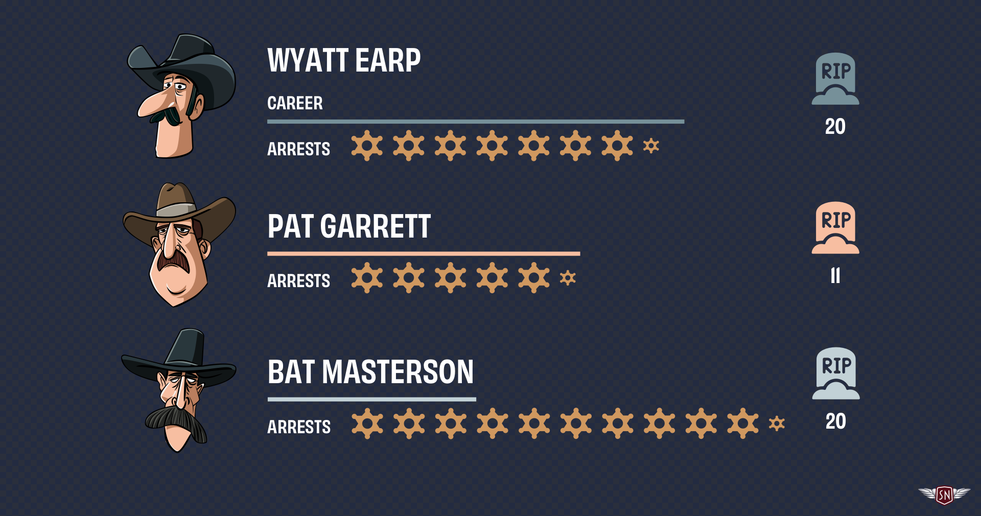
Each sheriff’s profile uses the same set of SVG three symbols: one for a bar representing the length of a sheriff’s career, another to represent the number of arrests made, and one more for the number of kills. Passing custom property values to each `` instance can vary the bar lengths, arrests scale, and kills colour without duplicating SVGs. I first created symbols for those items:
```
```
Each symbol accepts one or more values:
* **`--career-length`** adjusts the `width` of the career bar.
* **`--career-colour`** changes the `fill` colour of that bar.
* **`--arrest-scale`** controls the arrest badge size.
* **`--kill-colour`** defines the `fill` colour of the kill icon.
I can use these to develop a profile of each sheriff using `` elements with different inline styles, starting with Wyatt Earp.
```
```
Each `` shares the same symbol elements, but the inline variables change their colours and sizes. I can even animate those values to highlight their differences:
```
@keyframes pulse {
0%, 100% { --arrest-scale: 1; }
50% { --arrest-scale: 1.2; }
}
use[href="#arrests-badge"]:hover {
animation: pulse 1s ease-in-out infinite;
}
```
CSS Custom Properties aren’t only helpful for styling; they can also channel data between HTML and SVG’s inner geometry, binding visual attributes like colour, length, and scale to semantics like arrest numbers, career length, and kills.
Ambient Animations
I started learning to animate elements within symbols while creating the animated graphics for my website’s Magnificent 7\. To reduce complexity and make my code lighter and more maintainable, I needed to define each character once and reuse it across SVGs:
```
```
But I didn’t want those characters to stay static; I needed subtle movements that would bring them to life. I wanted their eyes to blink, their feet to tap, and their moustache whiskers to twitch. So, to animate these details, I pass animation data to elements inside those symbols using CSS Custom Properties, starting with the blinking.
I implemented the blinking effect by placing an SVG group over the outlaws’ eyes and then changing its `opacity`.
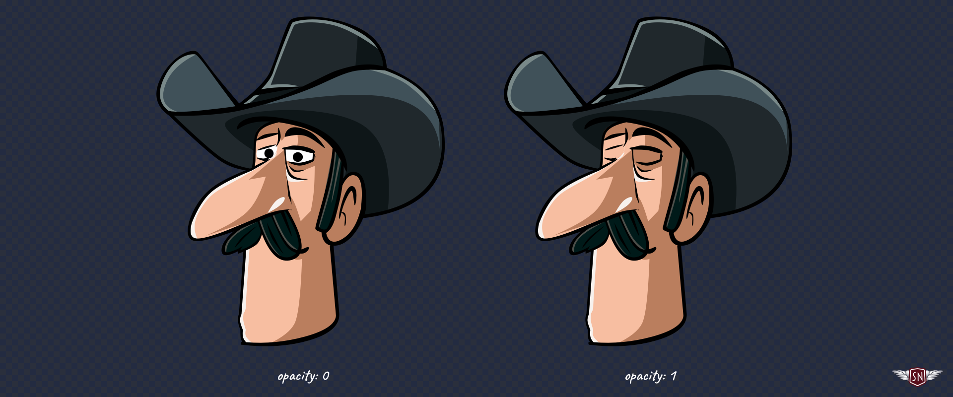
To make this possible, I added an inline style with a CSS Custom Property to the group:
```
```
Then, I defined the blinking animation by changing `--eyelids-opacity`:
```
@keyframes blink {
0%, 92% { --eyelids-opacity: 0; }
93%, 94% { --eyelids-opacity: 1; }
95%, 97% { --eyelids-opacity: 0.1; }
98%, 100% { --eyelids-opacity: 0; }
}
```
…and applied it to every character:
```
use[data-outlaw] {
--blink-duration: 4s;
--eyelids-opacity: 1;
animation: blink var(--blink-duration) infinite var(--blink-delay);
}
```
…so that each character wouldn’t blink at the same time, I set a different `--blink-delay` before they all start blinking, by passing another Custom Property:
```
use[data-outlaw="1"] { --blink-delay: 1s; }
use[data-outlaw="2"] { --blink-delay: 2s; }
use[data-outlaw="7"] { --blink-delay: 3s; }
```
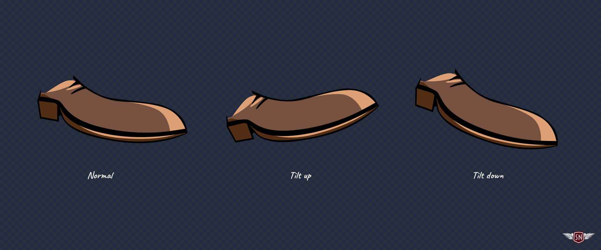
Some of the characters tap their feet, so I added an inline style with a CSS Custom Property to those groups, too:
```
```
Defining the foot-tapping animation:
```
@keyframes tapping {
0%, 60%, 100% { --foot-rotate: 0deg; }
20% { --foot-rotate: -5deg; }
40% { --foot-rotate: 2deg; }
}
```
And adding those extra Custom Properties to the characters’ declaration:
```
use[data-outlaw] {
--blink-duration: 4s;
--eyelids-opacity: 1;
--foot-rotate: 0deg;
animation:
blink var(--blink-duration) infinite var(--blink-delay),
tapping 1s ease-in-out infinite;
}
```
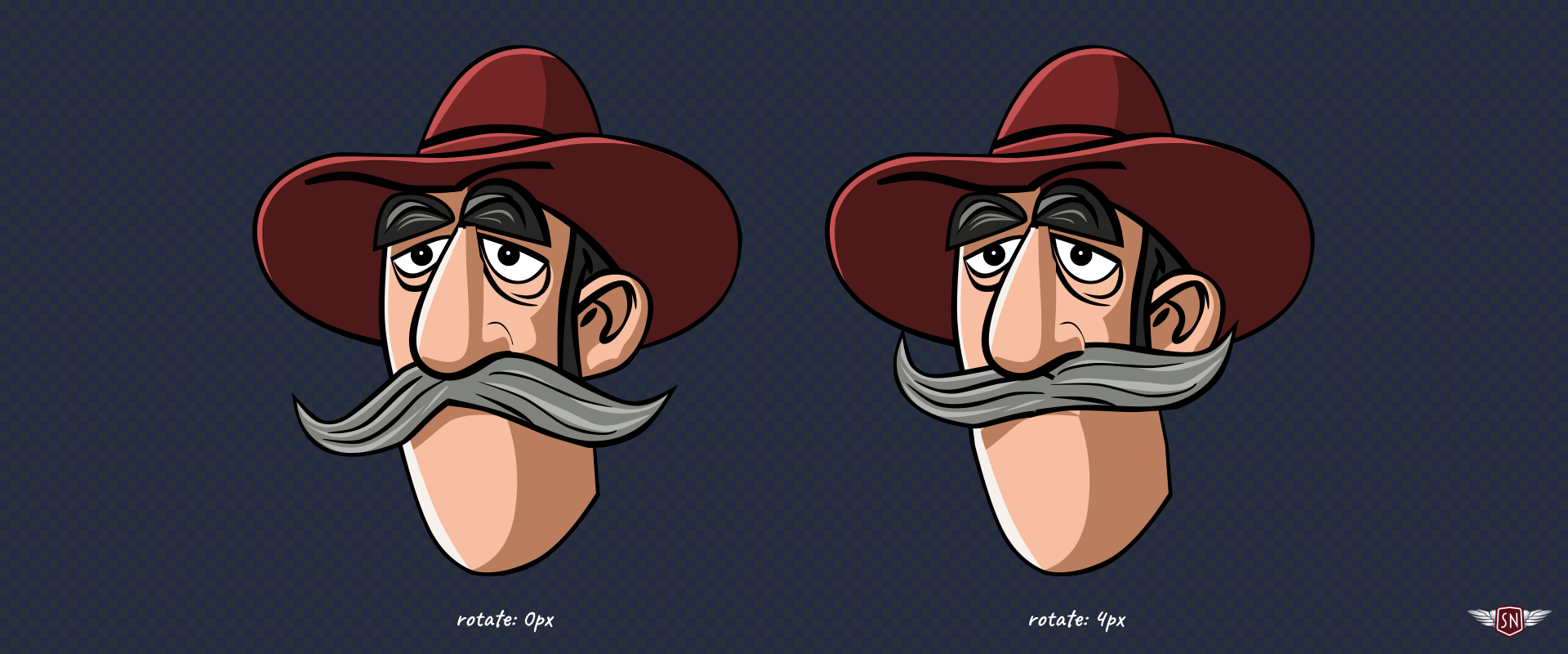
…before finally making the character’s whiskers jiggle via an inline style with a CSS Custom Property which describes how his moustache transforms:
```
```
Defining the jiggle animation:
```
@keyframes jiggle {
0%, 100% { --jiggle-x: 0px; }
20% { --jiggle-x: -3px; }
40% { --jiggle-x: 2px; }
60% { --jiggle-x: -1px; }
80% { --jiggle-x: 4px; }
}
```
And adding those properties to the characters’ declaration:
```
use[data-outlaw] {
--blink-duration: 4s;
--eyelids-opacity: 1;
--foot-rotate: 0deg;
--jiggle-x: 0px;
animation:
blink var(--blink-duration) infinite var(--blink-delay),
jiggle 1s ease-in-out infinite,
tapping 1s ease-in-out infinite;
}
```
With these moving parts, the characters come to life, but my markup remains remarkably lean. By combining several animations into a single declaration, I can choreograph their movements without adding more elements to my SVG. Every outlaw shares the same base ``, and their individuality comes entirely from CSS Custom Properties.
Pitfalls And Solutions
Even though this technique might seem bulletproof, there are a few traps it’s best to avoid:
* **CSS Custom Properties only work if they’re referenced with a `var()` inside a ``.** Forget that, and you’ll wonder why nothing updates. Also, properties that aren’t naturally inherited, like `fill` or `transform`, need to use `var()` in their value to benefit from the cascade.
* **It’s always best to include a fallback value alongside a custom property**, like `opacity: var(--eyelids-opacity, 1);` to ensure SVG elements render correctly even without custom property values applied.
* **Inline styles set via the `style` attribute take precedence**, so if you mix inline and external CSS, remember that Custom Properties follow normal cascade rules.
* **You can always use DevTools to inspect custom property values.** Select a `` instance and check the Computed Styles panel to see which custom properties are active.
Conclusion
The `` and `` elements are among the most elegant but sometimes frustrating aspects of SVG. The Shadow DOM barrier makes animating them trickier, but **CSS Custom Properties act as a bridge**. They let you pass colour, motion, and personality across that invisible boundary, resulting in cleaner, lighter, and, best of all, fun animations.
https://smashingmagazine.com/2025/11/smashing-animations-part-6-svgs-css-custom-properties/